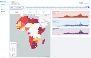
Over the past year, we have seen countless data visualizations, dashboards, and charts all detailing the spread of COVID-19 around the world. While some of these dashboards are excellent sources of information, few of them take into account regional variations in the factors associated with transmission. The COVID-19 in Africa Data Science Initiative is a collaboration between researchers at Boston University and other academic institutions around the world that was constituted to model and map the trajectory of COVID-19 on the African continent as well as develop tools to aid policy makers in real-time decision-making leading to efficient resource and therapeutic allocation. Data Clinic collaborated with the COVID-19 in Africa Data Science team to develop an open source interactive multilingual dashboard that facilitates access to their insights and supports decision-makers across the continent.

The dashboard, written using a React-based frontend and a NestJS API, displays infection, recovery, and death statistics for each African country along with COVID-19 infection forecasts based on the model produced by the COVID-19 in Africa Data Science Initiative.
The dashboard is still in development, with more features to come. Stay tuned for updates, and in the meantime — please share your feedback or open a ticket on GitHub.
To learn more about the methodologies and decisions behind the model and the dashboard, please visit their respective GitHub repositories:


