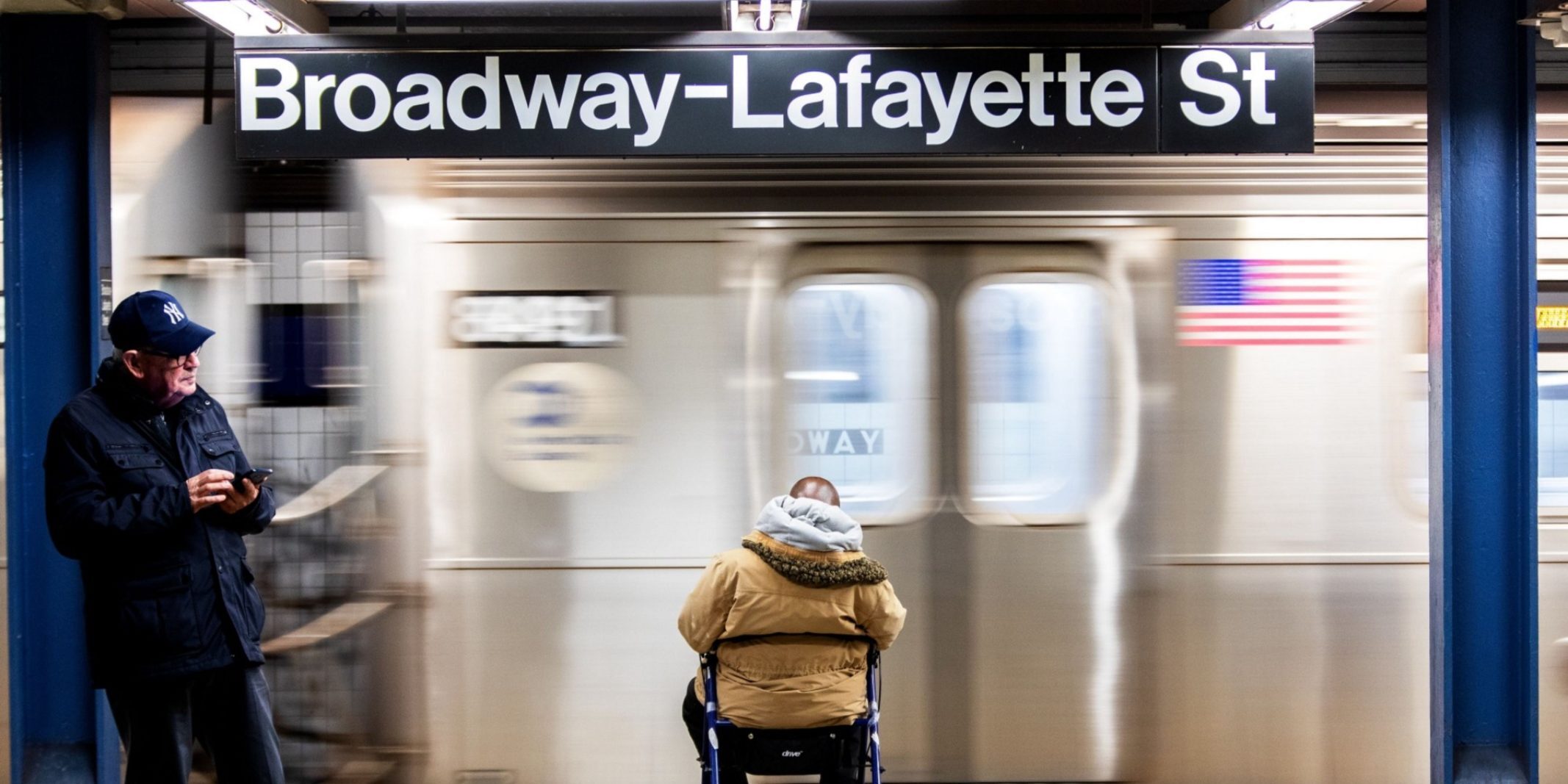
Inspired by the International Day of Persons with Disabilities, Data Clinic hosted a hackathon on the NYC Subway system’s accessibility. We set out to understand how data could help communicate and support the experience of commuters who rely on elevators. The open data on the NYC Subway was not released with complex analyses in mind, which meant that participants had their work cut out for them. Nonetheless, they made a lot of headway, and a core group was so passionate about the work that it continued well past the hackathon. Today, we release the first set of open source tools and data products from our efforts via GitHub.
Even though additional analyses remain in progress, we recognized the immense amount of work needed to get foundational subway information into a useful format, and were keen to share this resource publicly. Almost every day, we encounter articles and anecdotes related to transportation and accessibility, and we wanted to empower others to explore these stories through data as well. Plus, digging into this turned us into transportation geeks thanks to the history and unique quirks reflected in the data (did you know that from ~1910–1940, the system was run by two independent companies? One managed the lettered lines and one managed the numbered lines). We were too excited not to share it.
Mapping Subway Stations
Before we could start thinking about how you get from point A to point B across the city when you require the use of an elevator, we needed to get the lay of the land. Which stations have an elevator? And while you might expect that a station with an elevator is deemed accessible- that’s not necessarily the case. How do you get from point A on one level to point B on another level within a station? Which platforms of each station are accessible? Is the street level connected via elevator? We set out to map inter-station connections using MTA’s list of equipment and their free-text descriptions.
A host of regex, elbow grease, and field trips later, we managed to pull together graphs for every station with an elevator such as the examples below (not including stairways, escalators, moving walkways, and turnstiles). We were able to catch many errors due to challenging equipment descriptions, but some question marks remain. Readers are encouraged to check out our override list to contribute to improvements in these graphs.
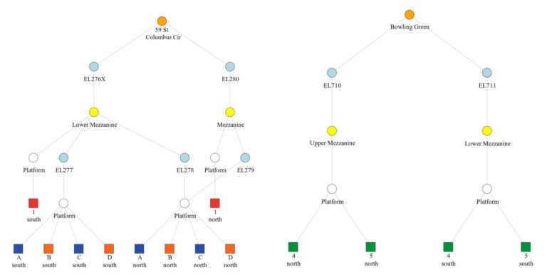
While we were at it, we knew we would eventually have to take a larger, system-wide approach to the experience of those reliant on elevators to truly understand how they get around. Looking at one station in isolation wouldn’t cut it, so we took the opportunity to also build in a station-to-station mapping to reflect the connections along and between lines.
Wrangling Turnstile Data
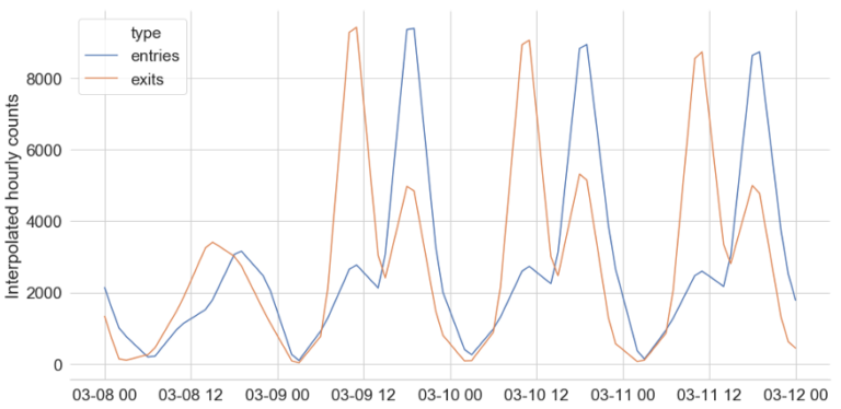
A natural next question is to wonder about the experiences of people using these stations and elevators. How might a single elevator outage impact users? Does it cut off access to the entire station or to a single line? How many people would be affected? While we don’t have any data on the use of the equipment itself, the MTA does publish turnstile data — information on the number of people entering and exiting stations. This can give us some idea of the amount of foot traffic at stations, and thus the potential population of elevator users.
Anyone who has used turnstile data before knows it’s no easy task. The data across turnstiles are released as cumulative counts with irregular resets, for roughly 4-hour snapshots that widely differ across stations and time. The analyses we had in mind would require the data at different resolutions. For example, 4-hour intervals aren’t fine-grained enough to study peaks within a given rush hour. So, we built a library that uses interpolation to estimate the traffic at any given frequency consistently across stations. With the code provided in our repo, you can pull interpolated turnstile usage information for stations for any given historical period.
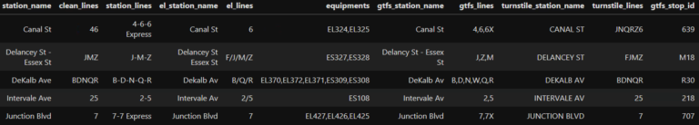
Building a Multi-Dataset Crosswalk
Connecting this commuter traffic information about a station with the station maps we built should be a breeze of a next step, right? Unfortunately, like most operational data, identifiers were built by different teams for different purposes at different points in time. On top of all that is the dizzying complexity of this massive system, where a station might have one name on the wall of the platform, another on the entrance placard, and yet another in the train conductor’s announcements (every NYC transplant knows all too well the pains of missing a station during their first month in town due to quirks like these). Some of this comes from stations across those two distinct managing companies mentioned above being combined into one single new station, such as Borough Hall/Court Street in Brooklyn.
All this is to say, we had no choice but to build a crosswalk in order to merge turnstile data, equipment data, and station location data. And — again looking ahead to other analyses we aim to release — we also included NYC train schedule data (GTFS, or General Traffic Feed Specification). You can now peruse these four different naming conventions for stations and lines in one consolidated file. Like the station mappings above, readers are encouraged to contribute to improvements to this crosswalk.
As our team continues to investigate the experience of elevator-reliant commuters and the operation of equipment in such an extraordinary complex, all of the above resources that make up the foundation of much of that work are now open to the public. Check out our open repo to pull station maps, finer-grained turnstile data, and vital crosswalks for your own analysis on the NYC Subway system. We also welcome your contributions, whether they are suggested edits or idea.
Stay tuned to this space for future updates and further analyses.