
Housing Navigator Massachusetts, a Massachusetts based non-profit, strives to connect people with places to call home. In August 2021, they launched a website that aggregates and makes searchable affordable rental housing options in Massachusetts. This digital tool is a response to what they, and many regional housing advocates, see as a glaring divide in the fabric of our society —who lives where and at what cost. Two Sigma Data Clinic recently completed a partnership with Housing Navigator MA focused on demonstrating how they might leverage their unique datasets to further their efforts.
The Ask
“Solid data will inform policy and surface broader housing needs. We are building the data that can drive decisions to improve the system and allocate resources more effectively to addressing our housing crisis.” –Housing Navigator MA, Our History
In 2022, we started working with Housing Navigator MA to help them understand how they can use data to challenge conventional notions about affordable housing. The task was to come up with data-driven ways to evaluate if the affordable housing available in Massachusetts met the needs of those looking for housing.
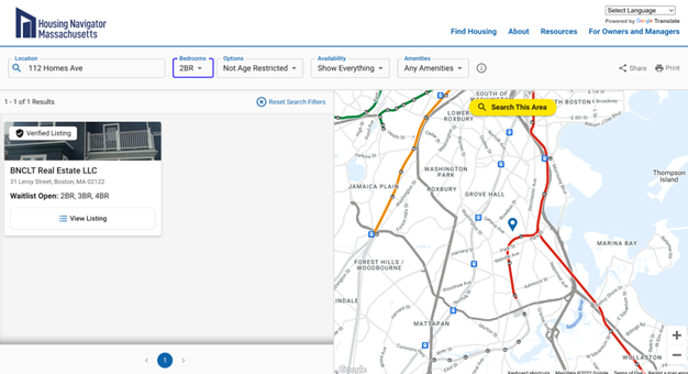
Normally, these kinds of analyses are stunted by a lack of housing inventory data. However, Housing Navigator has identified over 3,000 properties, as of April 2023, with income-restricted housing rentals across 280+ Massachusetts cities and towns. Their team manually curates this dataset. They also have Google Analytics data, typically prized in marketing analysis and search engine optimization. This programmatic website activity datafeed is an exciting dataset, but its highest value application for Housing Navigator is less obvious.
Early-Stage Insights on Affordable Housing in Massachusetts
Getting housing stock on the map (literally)
One of our first steps to understanding the data was to visualize them on a map. Apart from the fact that the brain processes visual information a lot faster than textual information, visualizations are particularly important in a geospatial context. Just looking at the data on a map can give us immense insights into the underlying structure and patterns.
We enriched the housing inventory dataset with data from the American Community Survey 5-year 2020 provided by the US Census Bureau and the Comprehensive Housing Affordability Strategy (CHAS) datasets provided by the Department of Housing and Urban Development (HUD). CHAS data includes specially prepared figures to estimate the extent of housing issues and needs, particularly for low-income households while the American Community Survey includes a broad range of socio-demographic indicators. Contextual data helps us reason around the circumstances of potential housing seekers, perspectives that we’re unable to directly capture.
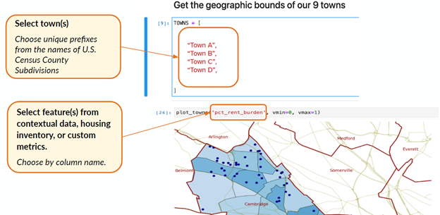
To access census data, we decided to use an open-source package, built by one of our project volunteers, called Censusdis. In Housing Navigator’s context, Censusdis allowed us to do two things. First, we were able to download US Census data to join with Housing Navigator’s proprietary housing inventory data to generate new insights. Second, we were able to easily generate fine-grained maps that allowed us to visually identify local populations that may be underserved or overserved by existing affordable housing options. They can also help identify where local policy changes could improve the distribution of affordable housing relative to populations in need. The maps are generated by a Jupyter notebook that is easy to modify and re-run for different towns and/or variables.
Constrained Case Studies and Willingness to Fail
With this visualization tool in hand, we turned our attention towards investigating the data. To lend structure to Housing Navigator’s ask — i.e., show what can be done with the data — we opted to do a tightly constrained case study. For our project, the accuracy of case study results is less important than inspired discussion around the validity of the approach and interim findings.
Tightly constrained case studies create opportunities and drawbacks. A pro is that they help organizations by shining a light on what the data represent and how they can be applied in real world contexts. This process is particularly valuable in situations when organizations, like Housing Navigator, have “the key before the lock,” and are exploring the different stories the data generated as part of their programs and services can tell. The con of tightly constrained case studies is that at least part of your analysis will fail to generalize to real-world situations because you are setting aside key considerations that help explain actual underlying phenomena.
Exploring Sub-Populations
Housing Navigator provided a list of nine towns to feature in the case study. These towns were selected because they had more complete affordable housing inventory data and we could work with the data without worrying about spurious results due to data missingness. They were not selected with the expectation that they were representative of Massachusetts. Because of this, we have anonymized the towns to navigate our readers away from false conclusions.
We started by looking at the Area Median Income (AMI) of the nine towns in our sample. Both federal and local governments use AMI to understand discrepancies in housing affordability, establish Fair Market Rents (FMRs), and set income limits for HUD programs. Sub-80 percent AMI is a common affordable housing eligibility threshold.
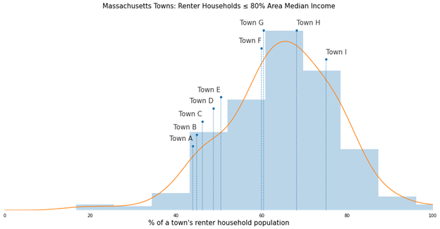
Looking at the distribution of each town’s percentage of households with an income that is less than 80% AMI helped us understand how many households might qualify for some form of affordable housing. Plotting the nine towns in our sample allowed us to visually compare each town to the rest of Massachusetts. Based on just the information presented in Figure 1, it looks like our towns are well-to-do. Most fall to the left of the distribution. How much affordable housing is needed?
When we explore subpopulations in the data, the trend shifts. Households with incomes below 30% of the AMI are classified as “extremely low income.” For this segment, most of the nine towns trend towards the average. There are likely to be vulnerable households in each of these communities.
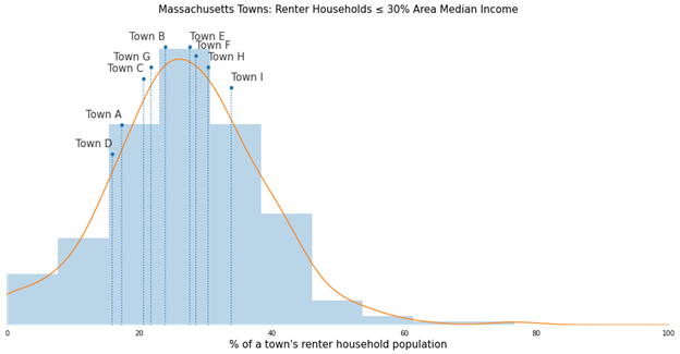
A distribution like the one above could fit nicely within a qualitative report or scorecard, rich in qualitative indicators. For example, in Figure 1, Town B appeared relatively well-off compared to Massachusetts average, but in Figure 2 it behaves more like an average Massachusetts town. About 25% of Town B’s affordable housing seeker population consists of extremely low-income households. However, it is also possible that this segment mostly comprises university students, an important context clue to keep in mind. Additionally, the AMI variable we’re using is not disaggregated by tenancy; some of these households could own their homes and aren’t on the market for rental units.
Cross Town Comparisons with Single Number Summaries
Since some affordable housing funding and policy is determined regionally — across towns — the team wanted to try for quantitative metrics that would allow Housing Navigator Massachusetts to contrast the state of affordable housing at-a-glance.
Single number summaries work best when they are all oriented around a unifying concept. For this case study, we explored what might constitute “good” housing stock: it should be ample and in accordance with local area eligibility. The intuition behind this is straightforward. Imagine you are ordering t-shirts for your office. First and foremost, you want to have the correct number of shirts. But you also want those shirts to fit. The distribution of sizes should align with the actual t-shirt sizes of your colleagues. Having all mediums won’t cut it — some will need larger or smaller sizes. The same applies for housing.
But to further our research, we needed to make a few assumptions to numerically frame this concept where the dataset was lacking:
- Minimum Income Thresholds: Income-based qualifications are common to affordable housing allocation. A maximum income (i.e. your earnings must be at 60% of AMI or less) is knowable and a field in the dataset. Minimum acceptable income is more sensitive, harder to collect, and less widely discussed (i.e. if you earn too little, you won’t qualify). After some discussion, we constructed our distinct bands in alignment with the CHAS HUD AMI brackets.
- Desired Unit Size: We reasoned that it would be a fair assumption to say that a small family (defined by HUD as up to four people) who mostly seek to qualify for 1–2 bedroom units. We reasoned similarly for other unit sizes. This unit size matching felt important because AMI-based eligibility cut-offs can vary by family size, so not all units are truly available to all potential applicants.
Here’s this idea expressed as a ratio:
The ratios in Figure 3 are compelling because they contain unexpected disparities. For 34 extremely low income (sub 30% AMI) small families in Town F, it appears that there is only one 1-2 bedroom affordable unit available. In Town H, for each small family in the 50-80% AMI bracket there are almost fifty-six 1-2 bedroom units available. When we see disparities, this unbalanced, we are motivated to explore information that might explain what we’re seeing. Especially for Town H, could our assumptions on minimum AMI thresholds be further skewing this information? It’s worth additional data quality checks and qualitative investigation to determine if there’s an alternate approach.
Studying Renter Income Data
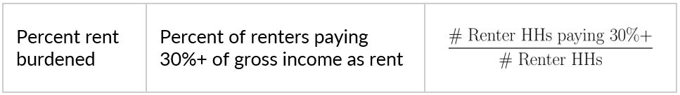
How can we further quantify how well a town’s inventory of affordable housing development might suit the needs of the local area? A parallel probing of the ACS 2020 5-year census data added an additional layer of intrigue. Across a standard set of measures, some towns looked quite similar at first glance: small, high income with similar rents and number of affordable units. However, the difference in the percentage of the population experiencing rent burden, meaning a household is spending more than 30% of their gross income on rent, seemed stark. One example was 59% compared to 31%.
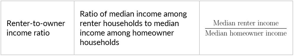
The median income and median rent ACS 5-year variables are also available disaggregated by tenancy and breaking down median income by renters and owners provided further context on the difference between Town H and Town D. Based on data from the American Community Survey 2020 5-year, we see that residents who rent rather than own have lower median incomes in both towns, but renters in Town H on average earn half of what Town D renters earn — $50,000 compared to $100,000. In fact, we found that across the state, renter-to-owner income ratio is strongly correlated with rent burden, and that both could act as single number summaries expressing the need for affordable housing. The example makes it clear that looking at the high-level statistics of median rent and income alone doesn’t accurately convey the nuance of a region’s housing needs.
The Pitfalls of Simplifying Assumptions
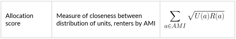
In addition to our single number summaries of rent-to-owner income ratio and percent rent-burdened, we transformed the ratios in figure x into a single score using the Bhattacharya coefficient. The coefficient is a value between 0 and 1. A 0 value means that the distribution of units is very different from the distribution of renters and a value of 1 indicates near to perfect alignment.
Using these single number summaries (percent rent burden, renter-to-owner income ratio, and allocation score), in addition to the more elaborate descriptive information that comes from Comprehensive Affordable Housing data, we saw overall that towns with better allocation scores appeared to have lower rates of rent burden (see Figure 4 below).
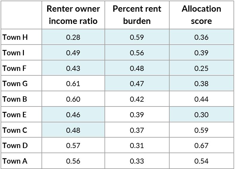
But could we fully lean into the values above? Not entirely — our pursuit of a heavy-weight single number summary fell short. It turned out that the assumptions we made while bracketing the unit AMI data were overly ambitious and ultimately misrepresentative.
Affordable housing programs in the US are not federated. They vary across time and municipality, with so many overlapping sets of requirements and mandates that it’s hard for domain experts to keep them straight. In fact, this complexity is part of the reason why Housing Navigator’s web-based intervention is so needed. However, it also means that the minimum acceptable income for many of these units is not easily assumable. Privately owned properties set their own minimums and are not obligated to share them. Conversely, income-based rent supplemented by a section 8 voucher doesn’t adhere neatly to a min/max AMI schema at all. The allocation scores and ratios — especially the extreme ones — were obscuring the reality on the ground. In some cases, it made it look like there was a vast oversupply of affordable housing while in other areas it looked like there was none.
The Future
We look forward to seeing how Housing Navigator evolves in the coming years and where they chose to apply their data. We look forward to applying the learnings here to future projects and continuing to support impactful nonprofits through data-driven inquiry.
While these quantitative and qualitative metrics have the potential to facilitate cross-town comparisons and high-level insights, numbers alone can never tell the whole story. Just as our initial look at Town H and Town D illustrated, it’s crucial to dig further into the stories behind the statistics to better understand what on the surface seems like a success or a miss. More granular information on AMI requirements could perhaps make the “allocation score” a reality.
Of course, basing the case study and metrics development on a subset of towns and cities limited the analysis’s complexity, but it also limited the generalizability of results. Low sample sizes mean that estimates are statistically less reliable and the towns in question are mostly small and high-income. Future manifestations of this work might focus on validating these results in larger, more diverse places in Massachusetts such as Boston and Worcester. Or perhaps it should target places with the highest rent burden, as these could be where affordable housing is needed most.