
In a previous post, Data Clinic looked at how the COVID-19 pandemic led to an increase in residential energy consumption and discussed this finding in light of already high energy costs in several parts of the country. In this post, we dig into the EnergyStar building efficiency scores posted outside many buildings in NYC and examine how residential energy consumption normalized by square footage paints an incomplete picture of efficiency.
What is the EnergyStar Score
NYC’s energy benchmarking project began in 2009 and is evolving to this day. Policies aim to increase transparency around energy performance and incentivize building owners to reduce the amount of energy their buildings consume. Local Law 84, for example, requires property owners to report energy consumption and water use data for buildings larger than 25,000 square feet. This information, along with the purpose and specifications for the building are used to calculate a 0-100 EnergyStar score. Local Law 33 expanded the scope of this legislation and mandated that property owners display their scores and created a letter grade system. Low scores don’t come with penalties, but Local Law 97, passed in 2019, dictates that starting in 2024 the city will begin to implement fines for building owners who exceed certain emission thresholds.
The EnergyStar ratings emphasize easy data collection and interpretation. They don’t involve any direct measurements of conventional aspects of energy efficiency like how well the structure retains heat or how well its heating and cooling system works. Ratings are based around the metered energy consumption for each building and scores are calculated as percentiles. A building with a score of 90 consumes less energy than 90% of similar buildings. Letter grades are assigned based on a score cut-off. For instance, any building scoring above an 85 receives an ‘A’. The idea is that absent information about a particular building, just knowing how much energy it consumes relative to other buildings provides evidence of how efficient or inefficient it is.
We’ll go a bit deeper into the specifics of the methodology later on in the post, but at a high level, the scores are calculated with a statistical model. The model is important because without making statistical adjustments, the scores would penalize buildings that consume more energy for reasons unrelated to efficiency, such as being located in a cold climate. Each building’s actual energy consumption data is compared to the amount of energy the model predicts it should consume. Buildings that consume more energy than predicted are given lower scores, while those that consume less than predicted score higher.
The Data
The scores and grades aren’t just posted outside of your workplace or apartment building: they are available in a repository provided by NYC’s Department of Buildings. This dataset doesn’t contain much information other than the rating and grade for each building. To learn more about the buildings and the neighborhoods they reside in, we brought in building-level data from NYC’s MapPLUTO database and socio-demographic data from the US Census Bureau’s American Community Survey. By joining these data sources together, we can examine associations between a building’s characteristics (e.g. the size of the building or the number of units it contains), the neighborhood it is located in, and its EnergyStar rating. To limit our analysis to residential buildings, we used the MapPLUTO database to exclude buildings that include space dedicated to other types of activity, such as office, commercial, or factory space.
Where are NYC’s most efficient neighborhoods?
We can start by comparing scores across neighborhoods. As Figure 1 and Table 1 show, the neighborhoods with the highest average efficiency scores (darker purple color) are all located in Manhattan: East Midtown, the Upper East Side, and the Upper West Side while the neighborhoods with the lowest average scores are scattered throughout Brooklyn, Queens, Staten Island, and the Bronx. Manhattan has the highest scores by a wide margin (62.3) with an average score 8.4 points higher than Queens (53.9), a difference nearly as large as that between Queens and the least efficient borough, Staten Island (44.5).
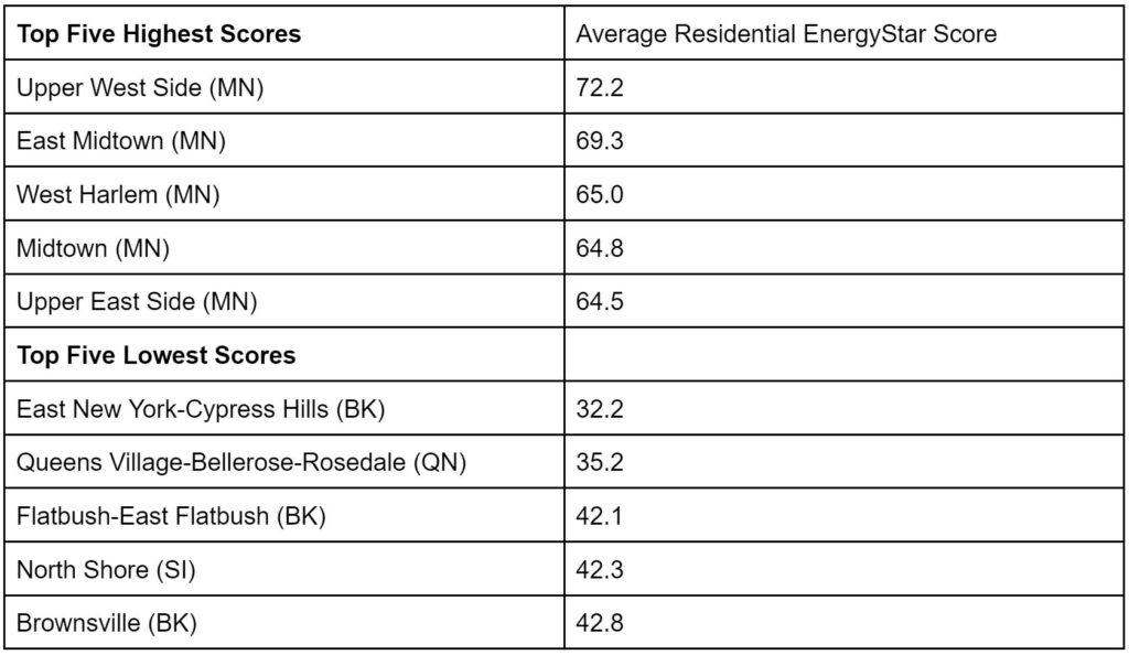
Upon visual inspection, it appears as though the EnergyStar ratings tend to be higher in more affluent neighborhoods within each borough. In Brooklyn for example, the high-income community districts of Downtown Brooklyn/Fort Greene (rank: 7, avg score: 62.8) and Park Slope/Carroll Gardens (rank: 11, avg score: 59.7) rank higher than more disadvantaged neighborhoods such as East New York (rank: 59, avg score: 32.2), Brownsville (rank: 55, avg score: 33.3), and Flatbush (rank: 57, avg score: 42.1) which all appear in the bottom five.
Figure 1: Map of Average EnergyStar scores by community district
A deeper dive into the socio-demographic associations confirms this impression. Across community districts, we find moderately negative correlations between the average EnergyStar score and the percentage of residents living in poverty (R = -0.40) and the percentage of residents who are Hispanic/Latinx (R = -0.21), and stronger negative correlations between EnergyStar scores and the percentage of residents experiencing rent burden (R = -0.52) and the percentage of residents who are Black (R = -0.53). Why might the EnergyStar scores in these communities be so much lower?
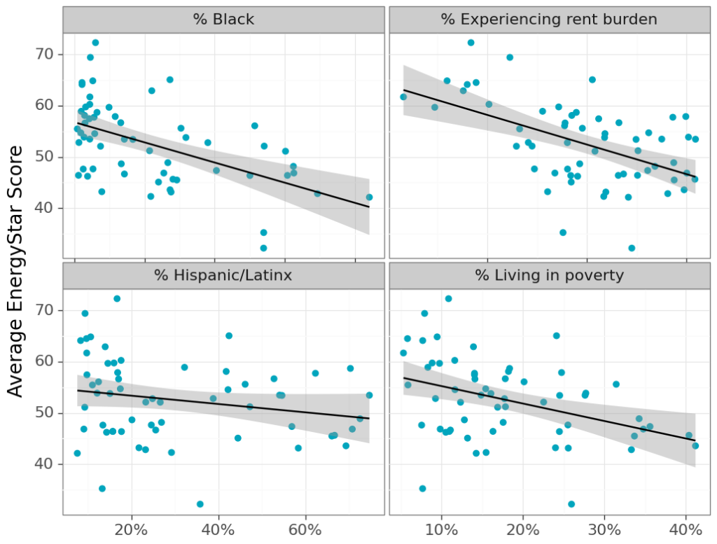
Research has established a strong link between income and energy burden: a 2019 report by the NYC Mayor’s Offices of Sustainability and Economic Opportunity found that annual energy costs were highest in the outer boroughs, and national research has found that low income households nationwide spend almost 3 times as much of their income on energy as do high income households. Other research has found that Black and Hispanic/Latinx households have a higher energy burden than other households. Residential factors such as older, less efficient appliances, inefficient gas/oil boilers, and less effective insulation contribute to these gaps.
However, despite this evidence, there is still something unexpected in the EnergyStar correlations. One might think that the reason that lower income households spend more of their income on energy is that they have less income to begin with, not that their energy cost (or consumption) is higher in absolute terms. In fact, the opposite is more likely: in general, higher income is associated with higher rates of consumption – a trend that holds true for energy consumption in the United States. A 2020 paper written by a group of researchers at the University of Michigan found that high income households in the United States have much higher per-capita energy consumption than lower-income households. The major cause of this trend is that higher income households tend to have larger living spaces – meaning more square footage that needs to be heated or cooled and more room for energy consuming electronics and appliances. Caution should be exercised applying these national findings to NYC – unlike most of the US, most residents live in apartments rather than single family homes, and some of NYC’s densest neighborhoods are among the highest in income. Still, the basic mechanism is hard to deny. People with more money can afford to live in bigger apartments that require more power to maintain.
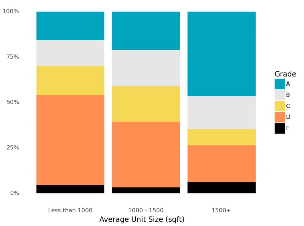
However, if we dig into the EnergyStar data in NYC, we see a clear pattern: apartment buildings with larger average unit sizes have higher EnergyStar scores than buildings with smaller units (see Figure 3 below). The difference is stark. Nearly half of buildings with an average unit size greater than 1,500 square feet earn an ‘A’ grade and only a quarter receive a ‘D’ or ‘F’, while the majority of buildings with an average size below 1,000 square feet receive a ‘D’ or ‘F’ and roughly 15% get an ‘A’.
This trend is surprising because: 1) the EnergyStar scores are based on each building’s metered energy consumption and 2) larger living spaces have been shown to be strongly associated with higher rates of energy consumption. With those facts in mind, how could it be that buildings with larger units have higher EnergyStar scores? The answer can be found with a closer eye to the methodology used to calculate the scores.
Unpacking Housing Efficiency
Energy efficiency turns out to be a trickier concept than it first appears. The idea sounds simple – in the EPA’s own words, “Energy efficiency is about using less energy to get the same job done.” Fair enough. But what defines the “getting the same job done” when it comes to housing? In other contexts, the answer is straightforward. When it comes to (gasoline powered) cars, a more efficient car gets more miles to the gallon. An efficient washing machine uses less electricity and water to wash the same amount of clothes. An efficient lightbulb gives off the same amount of light while requiring less power, etc.
Housing is different. Unlike those examples, a house or apartment serves many functions – our homes are where we sleep, cook, relax, and more – so it’s not as clear what “job” is being done. That fact makes it harder to decide what makes one home more efficient than another. One potential answer is that an efficient apartment building uses less energy per unit. Under that definition, we’d expect buildings with large apartments to be less efficient than buildings with smaller units since more energy is required to heat and cool a larger space. However, this is not the definition behind the EnergyStar scores. Instead, the EnergyStar ratings base their measure of efficiency on “energy use intensity” (EUI) which is equivalent to energy consumption per square foot. This isn’t unusual – EUI is the standard way of assessing the energy efficiency of a building, but it has some surprising effects when it comes to housing.
It’s worth teasing out some of the specific implications of this methodology. The most important is that the large increase in energy consumption that comes with larger living spaces is not reflected in the EnergyStar scores. This isn’t insignificant since larger living spaces are a major driver of household energy consumption. Research has found that in Los Angeles County, decreases in household EUI of newly built homes are more than offset by increases in the size of those homes. The counterintuitive result is that as homes have gotten more efficient (by the EUI standard), they have increased their total energy consumption. Returning to the NYC data, we can see how this effect might be involved in the correlation we saw between lower income neighborhoods and worse efficiency ratings. Under the EUI definition of efficiency, many of the most spacious (and expensive) condominiums on the Upper East Side score well and many of NYC’s public housing developments score terribly, but this doesn’t mean that they are consuming less energy on a per-unit basis.
This fact is counter-intuitive, but there are reasons that defining efficiency using the EUI standard can be useful. One of the major purposes of requiring building owners to post their EnergyStar scores is to help identify buildings where retrofitting would reduce the amount of energy the building consumed. If the main reason that a building is consuming more energy is that the apartments inside are large, there isn’t much that an owner can do to improve efficiency. On the other hand, if an outdated heating system is responsible for increased energy consumption, the boiler can be replaced with a newer model, improving the efficiency of the building. By removing the effect of larger living spaces from the efficiency calculation, the EUI version of efficiency can hone in on drivers of energy consumption that are easier to improve. This is a tradeoff: basing the ratings on EUI makes the scores more actionable for individual building owners, but it obscures the role that size plays in energy consumption across buildings.
Conclusion
What makes one apartment building more efficient than another? Any particular methodology for calculating an energy rating contains an implicit answer to this question. The answer given by the EPA’s EnergyStar rating for multifamily housing is that efficient buildings consume less energy per square foot than buildings with similar characteristics. There’s nothing wrong with this definition – it’s perfectly appropriate for many of the purposes the scores are intended to fill. Still, basing a measure of efficiency around energy use per square foot will always come with the caveat that the large increases in energy consumption associated with larger living spaces are not considered to be inefficient.
NYC’s efforts to improve the efficiency of its housing stock should be applauded. But there is a possibility that without the proper context, the EnergyStar scores can undermine the city’s ambition to “[Bring] transparency to energy use in New York City’s buildings.“ For now, the potential downsides are minimal. The EnergyStar ratings are mainly cosmetic; they are posted outside of buildings and not much else. However, starting next year, NYC will begin to impose penalties on the owners of buildings that fail to meet emissions standards. Like the EnergyStar scores, these standards are pegged to emissions per square foot. For this reason, they will likely exhibit similar trends to the EnergyStar scores. These penalties come with significant exemptions – for instance, buildings with more than 35% rent stabilized units are given alternative compliance options – but even with these allowances, it’s possible that per square foot standard will mean that buildings in some of NYC’s most disadvantaged neighborhoods will bear the brunt of the penalties. We do not have to speculate; both the emissions standards and the underlying building-level energy use reporting data are publicly available. In the next post in this series, we’ll take a much closer look at the way buildings are consuming energy across the city, with an eye toward furthering our understanding of these disparities.
To see the code and data underlying this analysis, head to our GitHub repository.