During recent months, the COVID-19 pandemic has reshaped the world, causing devastating damage to the global economy. The world is now in the deepest recession since the Great Depression in the 1930s, with GDP declines of greater than 20% in many countries.1 As the world’s largest economy, the U.S. has experienced the highest unemployment rate since the Great Depression,2 the biggest monthly drop in non-food-and-energy CPI (“Core CPI”) since the 1950s,3 and the sharpest quarterly GDP contraction since the Global Financial Crisis (“GFC”) in 2008.4 Both 10-year and 30-year U.S. Treasury rates hit all-time lows in March,5 and credit spreads have widened.6 The stock market plunged in March and triggered circuit breakers four times in two weeks.7 Both consumer confidence and business confidence have dropped8 due to business shutdowns and shrunken consumer demand. All of these facts reflect that the country is right in the middle of one of the most challenging economic conditions in its history, which is familiar in some respects and unfamiliar in others.
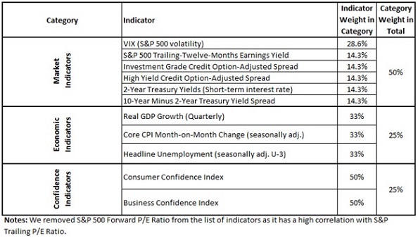
We are certainly familiar with the fact that the economic cycle can reach a trough periodically, which is evident throughout history. It is sensible to check which historical periods are most similar to the current situation to see what can be learned. To do so, we will be revisiting our previous Street View “Markets in the Rear-View Mirror (May Be Closer than They Appear)” published in May 2018, and extending the data through May 2020. The previous Street View proposed a method to measure the Euclidean “distance” between today and all other periods going back to 1990 using a model of market, economic, and confidence indicators.10 This distance can tell us how similar the environment today (or any period of interest) is to all other historical periods. We then calculate the distance between every single historical month and the current crisis period defined as March, April, and May 2020.11
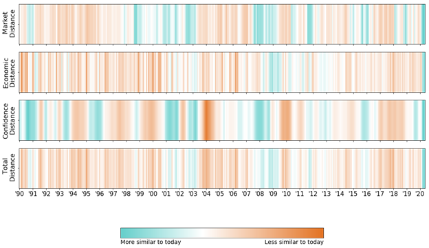
The figure below uses color maps to identify which historical periods are similar to the current crisis period in terms of market, economic, confidence and overall distances. Each vertical line represents a month. Teal-colored lines are more similar to today’s conditions, while orange bars are less similar.

Let’s start by looking at some similarities of the current state of the world to previous regimes. Looking at the distance color maps, it is obvious that we are in a very different economic regime from May 2018, when we published the “Markets in the Rear-View Mirror (May Be Closer than They Appear)” Street View.
The “Market Distance” metric, which combines different market indicators including VIX, S&P Earnings yield, credit spreads (IG, HY) and rates (2yr, 10yr Treasury yields) suggests, unsurprisingly, that the recent months appear close to a series of historical crash/crisis periods. These crisis periods include big economic drawdowns, e.g., the 2008-2009 GFC, the 2000 tech bubble burst, and smaller-scale crashes, e.g., the Dec 2018 stock market drop, the 2015-2016 stock market sell-off, the 2007 quant quake, and the 2002 bear market following 9/11. Akin to what happened in 2008, the VIX and credit spreads surged, while rates and earnings yield plunged. In fact, in March 2020, the VIX13 reached its highest level since the GFC.
Next, as expected, the “Economic Distance” metric, a blend of real GDP, core CPI, and the unemployment rate, tells us a similar story: the economy has suffered dramatically, and again we have seen this before. Real GDP had a large contraction in late 2008, followed by a fall in the CPI and a hike in the unemployment rate.
Moreover, consumer and business confidence have had similar declines during almost all the historical crisis periods. Finally, the “Total Distance” metric, consolidating all the conditions measured, shows that the current period is closest to the GFC and the early 2000s recession.
Based on our statistical distance metrics, the current crisis bears some resemblance to previous downturns. However, no two leaves are exactly alike – the current crisis is also unique in several aspects.
First, the “Total Distance” color map shows that no period in the past thirty years is that close to the current crisis. To begin with, the cause of this ongoing crisis is unique, as it was ignited by a pandemic, a global healthcare emergency that arose outside the financial system. It has created unprecedentedly severe impacts on both the supply and the demand side of the economy.14 On the supply side, in order to restrain the virus from spreading wildly, restaurants closed, hotels and entertainment venues shut down, and airlines cut a substantial number of flights. Consequently, millions of people lost their jobs,15 driving the unemployment rate up to the highest levels since the Great Depression for two consecutive months (14.7% in April and 13.3% in May).16 On the demand side, consumers were restricted from shopping in-person as business closed, and travelers had to suspend or cancel their plans due to lockdowns. As a result, consumer spending declined, and more people were saving, especially in light of labor market conditions and general uncertainty.17 Hence, the Core CPI has been falling for three consecutive months (-0.10% in March, -0.45% in April and -0.06% in May),18 as demand in most sectors declined. The magnitude of these impacts contributes further to the uniqueness of the current crisis, and makes today’s economic conditions look more dire than any period in the past three decades.
Second, given the nature of the shock, the huge impact on the economy took place almost instantly this time. During the COVID-19 crisis in April, the unemployment rate reached a high of 14.7%, and the Core CPI experienced the largest monthly drop (-0.45%)–only one month away from the start of the crisis. In contrast, during the GFC, these indicators only incrementally deteriorated after the initial shock happened. The unemployment rate climbed gradually and peaked at 10% in October 2009, a full year after the start of the crisis, and the Core CPI had its biggest monthly decline (during the crisis period) in January 2010.19
This difference in speed is evident in the “Economic Distance” and “Market Distance” color maps during the GFC period. The period with the smallest market distance to the current crisis ended in early 2009; however, the period with the shortest economic distance to the current crisis lagged by a few months, extending until the third quarter of 2009. This is because the market and economic impact occurred relatively simultaneously during the recent crisis compared to the economic lag observed during the GFC.
Finally, let’s jump into a “time machine” and roll back the clock. If we were in January or February 2020, a mere month or two before the current crisis started in the U.S., what would be our distance to the current crisis? Using the same distance metric, we change the base period to Jan and Feb 2020, and then calculate the distance between every month and this pre-crisis period (shown below).

From the color map, as expected, the base period is close to periods of economic expansion, e.g., most periods from 2015 to 2019, 2006 to 2007, but it is completely different from crisis periods such as the GFC and the current recession. So, in March of 2020, we would be standing at the farthest possible point from February 2020’s regime in the space of just one month! This underscores our previous conclusion that the economy transitioned so sharply and abruptly from the preceding months. On the contrary, in the months leading to the outbreak of the GFC (September 2008), the economy already showed negative signs and started to drift away from a healthy environment. It is also consistent with one of the messages that we conveyed in our “Markets in the Rear-View Mirror (May Be Closer Than They Appear)” Street View: “even if skies look relatively clear for now (January and February), the rains can come at any time (March and April).”
In conclusion, while every crisis can look like others in quantifiable ways, they are all unique in their own way as well. This can be especially said of the current crisis. In particular, the current crisis has caused economic impacts unseen in the past thirty years, and it struck the economy quickly and without any warning. It is an important lesson for asset managers and investors who are used to analyzing their portfolios primarily with financial data, as they were likely caught by surprise this time. After observing how much damage a global public health crisis, something that seems far away from the financial system, can cause, investors would be advised to pay more attention to broader sets of events and data in the future.
The current crisis is certainly still ongoing, and we are not sure how much longer it will take before the economy fully recovers. However, both fiscal and monetary policies are geared towards saving the economy and pulling it out of the trough, and there are currently promising signs, such as a strong stock market rebound and narrowing credit spreads. If the economic cycle observed over history is any guide, a recession at present will be followed by a better future.
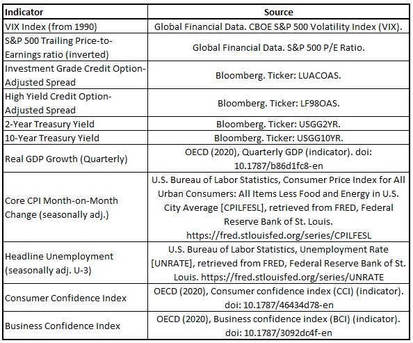
Appendix


