Hazardous industries
Louisiana’s “Cancer Alley” covers a 90 mile stretch in the Southeastern corner of the state. This region is home to hundreds of chemical plants, oil refineries, and natural gas processing facilities, many of which handle and emit toxic chemicals into the surrounding areas. For many residents, the effects have been dire. Research has shown that much of the region has carcinogenic air pollution in excess of government defined risk limits, and at least one study has found elevated rates of cancer. These dangers are not evenly distributed: Black and low-income residents of the area are at greater risk of cancer from these exposures.
Though Cancer Alley contains an unusually high number of these facilities, thousands exist in towns and cities across the United States. The potential risks posed by facilities like these caused the Environmental Protection Agency (EPA) to create the Risk Management Program (RMP) in an effort to catalog facilities handling certain “extremely hazardous substances.” The RMP collects basic information about facilities such as location and industry, as well as more detailed records of the chemicals handled, any accidents that have occurred, and plans for preventing and responding to accidents.
Historically, the EPA has made much of the data collected by the RMP available by request, but it hasn’t been convenient for researchers to access. That changed earlier this year when the Data Liberation Project – an initiative to improve access to important government datasets – published the RMP database for public use. For a recent Hack Day, Data Clinic brought together a group of Two Sigma data scientists and engineers to dig into this database, with a particular focus on understanding local disparities in the populations living close to one of these facilities.
The data
The EPA database contains records on 11,710 active facilities subject to RMP regulation. Our study zeroes in on a subset of facilities to improve the accuracy of the analysis. Particularly, we focus on RMP facilities located within urban areas (as classified by the US Census Bureau) that have at least five facilities. We have several reasons for this decision. Primarily, facilities nestled in densely populated regions expose more people to potential hazards compared to those in less populated areas. In addition, the diverse, often socioeconomically and racially segregated populations of American cities provide a clear backdrop for identifying potential disparities in exposure to hazardous industries. Lastly, the decision to filter the dataset improves statistical accuracy because the Census data in densely populated regions is estimated at a finer geographical grain, which allows for more precise insight into the populations living near to these facilities.
The source of our socio-demographic data is the US Census Bureau’s American Community Survey – widely considered the gold standard for this type of analysis – accessed using the python library censusdis. For each city in our analysis, we downloaded estimates of median income, race and ethnicity, home ownership, and home value at the census block group level. Census block groups are a sub-county geographic division with a typical population size between 600 and 3,000 people.
Figure 1: National map of facilities and urban areas
Measuring ‘fenceline’ populations
Our objective is to contrast the demographic and socioeconomic statistics from the immediate vicinity (the “fenceline zone”) of a facility to those of the broader urban area. We bound the immediate vicinity within a radius of one mile. By using local urban area statistics as our benchmark—instead of the national average—we can account for large variation in income and race across the country and arrive at a localized head-to-head comparison.
However, our strategy runs into an immediate analytic challenge: the US Census Bureau provides estimates of population statistics at various geographic grains, but none align with facility locations. We tackle this obstacle by defining a new geographic region: the subregion of an urban area that is within the fenceline zone of at least one facility. Once this region is defined, we recompute the census variables specifically for this area. The method we employ for this task is called “areal interpolation.” Producing these estimates requires a key assumption: that the population of each census tract is evenly and homogeneously spread across the tract. With this assumption made, we estimate the fraction of these attributes present within the newly defined region, and then sum them up to get aggregate values, calculating appropriate weights for each variable.
This methodology is employed for both the specific fenceline region and the entire urban area. This results in socio-demographic measurements for the area within the fenceline zone as well as for the entire urban area. With these statistics in hand, we are now equipped to compare populations living within a 1-mile radius of a facility and those residing in the urban area at large. This comparison enables us to pinpoint and study disparities that might exist within any particular city in our analysis.
Visualizing Exposure
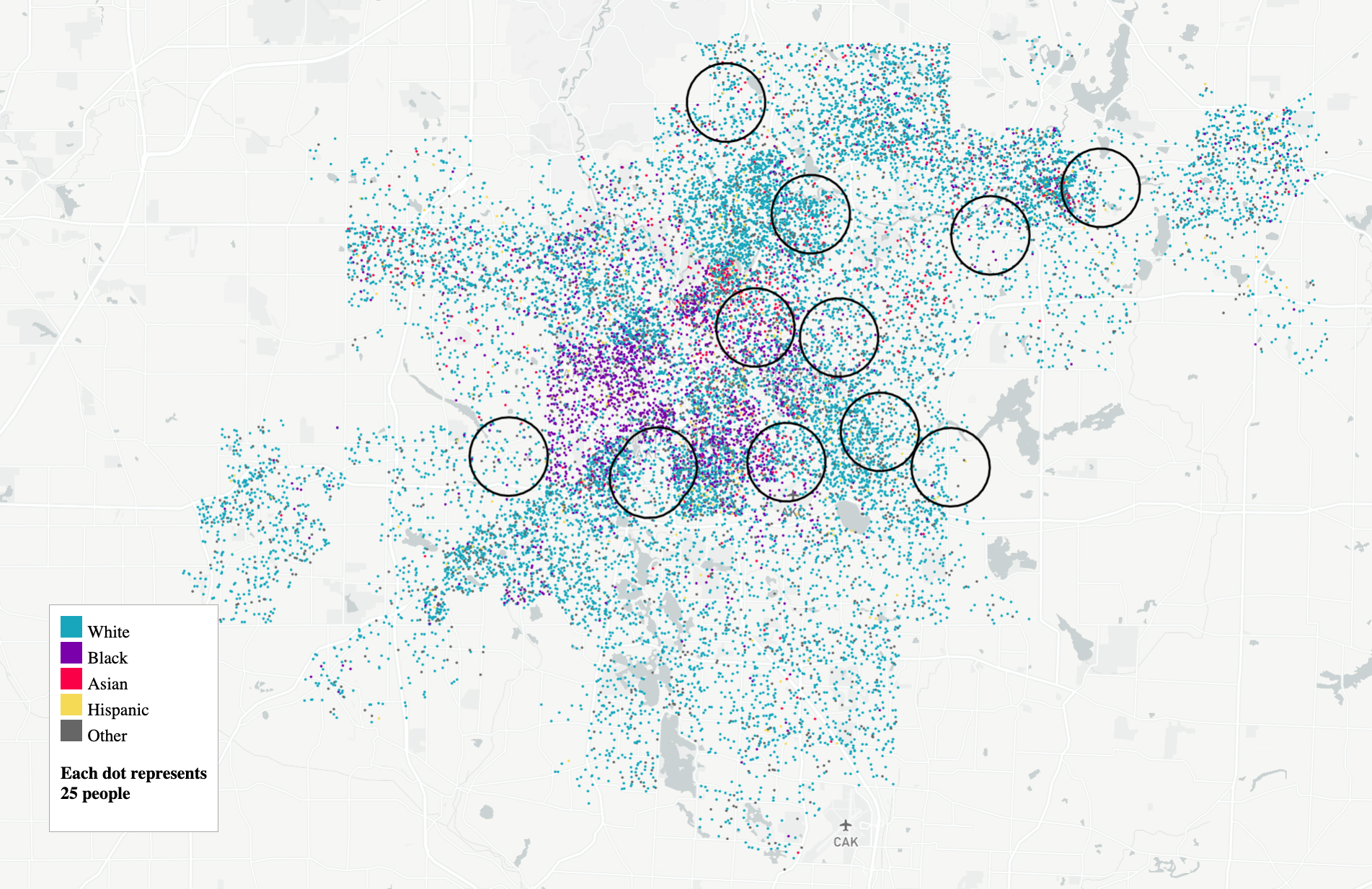
We found that an effective way to visualize information about the cities in our sample is with a dot-distribution plot. In the figures below, we utilize the underlying census data to disperse dots evenly across each tract, mirroring the assumption made by our areal interpolation method. Each dot represents a set number of residents within each census tract in the city, colored according to the demographics of the tracts.
These plots are particularly useful when you want to show several aspects of a city at once. For us, these are:
- Spatial demographic patterns across the city, including segregation
- The population density of different areas
- Where facilities and associated fenceline zones are located
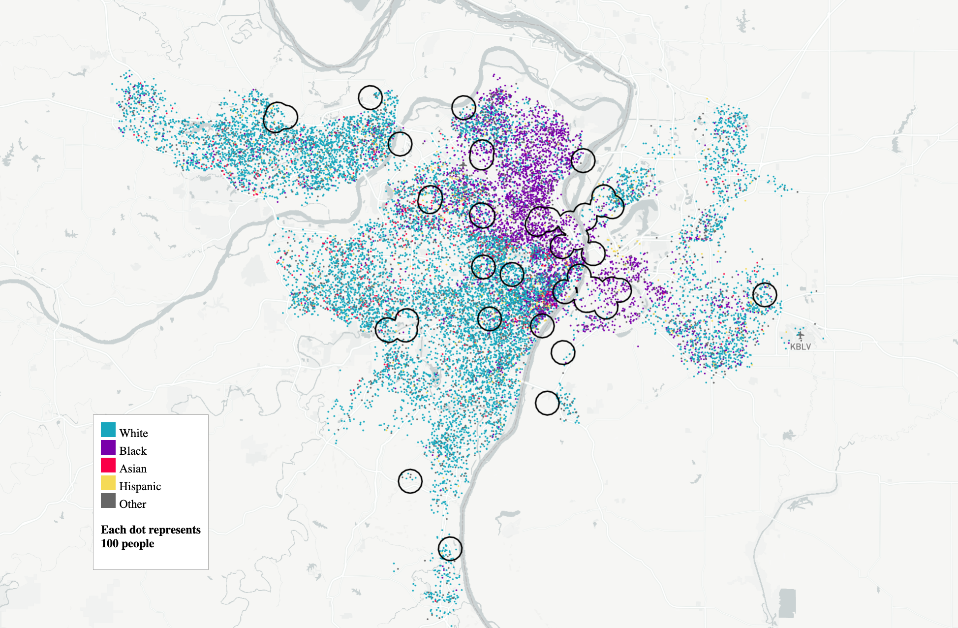
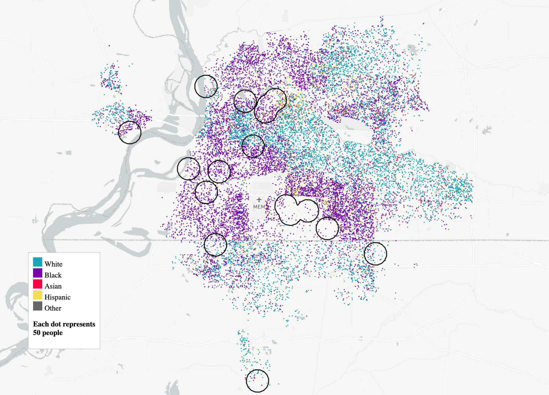
In some cities, the patterns of disparity in exposure are visually obvious. In Saint Louis, MO, a hub for the chemical and manufacturing industries, facilities are concentrated in the eastern and northern part of the city along the Mississippi river, where the majority of the Black population resides Although some facilities are located in other parts of the region, the portion of Saint Louis within one of these zones has nearly twice the proportion of Black residents. In Memphis, the story is similar. The RMP facilities – mainly chemical and petroleum plants – are located almost exclusively in the majority Black population neighborhoods north and west of the city. Not every city in our sample exhibits these kinds of inequalities. In Akron, Ohio, for example, the population living within the fenceline zones exhibits a similar race and income profile to the city overall.
We’re only including a few of these maps in the post, but you can visit our GitHub page to create them for any city in our sample.
Cross-city analysis
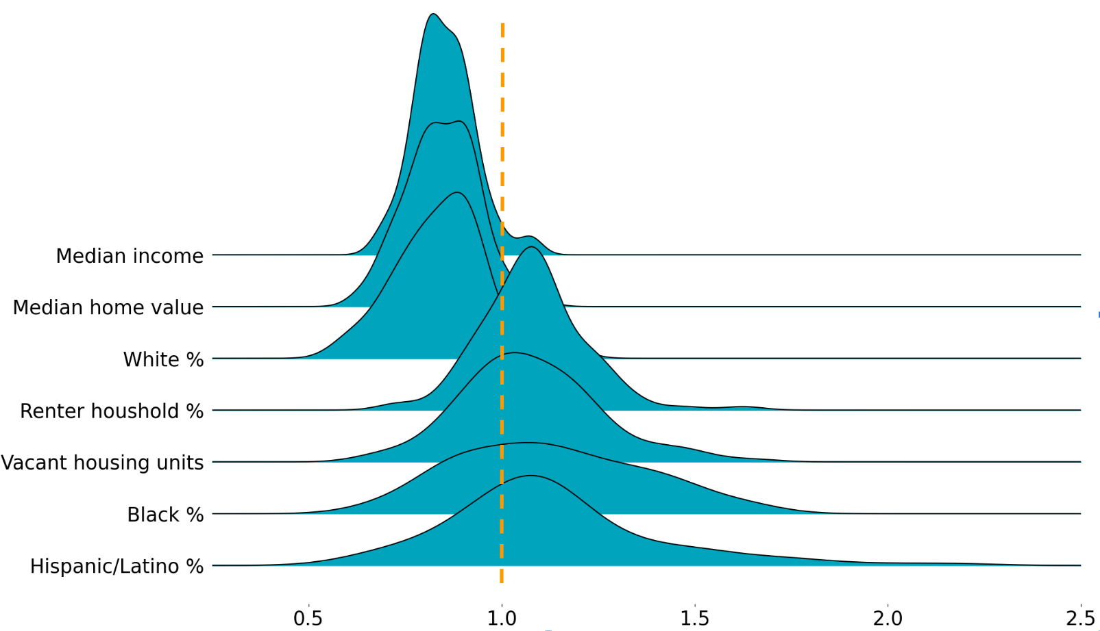
To assess patterns across cities, we need a measurement of fenceline-to-city disparity that we can calculate in each urban area. We achieve this by calculating the ratio of fenceline zone values to whole city values for each census variable. For instance, a 0.75 fenceline-to-city ratio for median income implies that the fenceline zone’s median income is 25% lower than the median income of the city. These ratios are handy because they standardize different units, letting us consider proportions like racial makeup and numerical values like income together.
Figure 3 plots these ratios across all the cities in our sample. We marked 1.0 on the x-axis to signify parity between fenceline zones and the respective cities. Values lie to the right of the line if the fenceline value is greater than the value for the surrounding area. Our constructed metrics reveal significant disparities. As figure 3 shows, fenceline zones are typically more disadvantaged than the surrounding area across all of our included measures. In 73% of cities, the fenceline populations have a higher proportion of Black residents than the city overall and in 78% the fenceline population has a higher proportion of Hispanic/Latino residents. Just 13% of cities have a higher proportion of white residents. The difference is even larger for income: 92% of fenceline zones have a lower median income than their cities.
Conclusion
These associations likely have many entangled origins. Existing research can point us toward a few possibilities. Housing discrimination and redlining restricted millions of Black residents to the least desirable areas of many cities, with lasting environmental justice impact. Today, residential properties close to industrial plants have reduced home values that appreciate at a slower rate and attract less economically affluent residents. Similarly, since proposed facilities often face local opposition due to the potential dangers they pose, neighborhoods with the least economic and political capital can be attractive locations.
Whatever the precise mixture of factors behind the disparities we found, our results are consistent with what other studies in related contexts have shown. In the U.S., Black, Hispanic, and lower-income people tend to live closer to superfund sites, be more exposed to air pollution, and reside closer to toxic waste sites.
Our analysis contains a number of limitations that future research could address. Since we chose to conduct our analysis only on facilities located within census-defined urban areas, none of our results apply to people living in rural parts of the United States. This omission is especially important because rural regions have a very different economic and demographic composition compared to cities. They also face different environmental challenges: certain damaging industries such as metal mining and fossil fuel extraction are overwhelmingly concentrated in less densely populated areas. We also did not address the question of which facilities are likely to pose the greatest risk to nearby populations. The RMP database contains some information that could be helpful such as accident histories and details about the chemicals being handled. The EPA has additional data on the potential damage from worst-case scenarios, but it’s only available in federal viewing rooms (see the Who’s in Danger report for a related analysis using this data).
Despite these limitations, our analysis offers a unique perspective, using a newly available dataset, to the conversation around an essential topic in environmental justice. We hope that further research will be able to further expand our understanding of how to ensure healthy and sustainable cities for everyone.